
What is a prototype
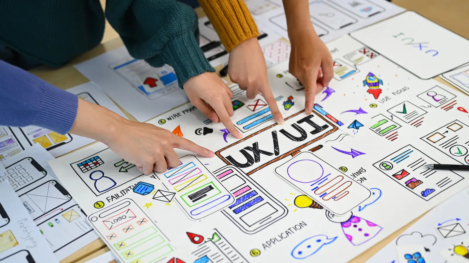
A prototype is a preliminary, testable representation of a product. It can be a paper sketch, a clickable Figma screen, or a functional app with fake logic. The goal is always the same: to learn something before spending money building the final product.
The word comes from Greek prototypos: "first model". In product design, prototyping serves to validate hypotheses — about usability, about desire, about technical feasibility.
A prototype is NOT:
- A beta version of the product
- A sales demo
- An MVP (despite the overlap, they are different things)
A prototype IS:
- A learning tool
- A cheap substitute for real code
- A communication mechanism between design, engineering, and the user
Types of prototype
Prototypes vary on two dimensions: fidelity (how close to the final product) and functionality (how much actually works).
Lo-fi (low fidelity)
Looks like: hand-drawn or wireframe without color, fonts, or real images.
Use it for:
- Testing flow (does the person understand the order of screens?)
- Testing information architecture (does navigation make sense?)
- Co-creation sessions with stakeholders
Advantage: fast and cheap. Nobody cares that it’s "ugly" — it’s clearly a draft.
Disadvantage: misses problems of visual hierarchy, microinteraction, or color.
Mid-fi (medium fidelity)
Looks like: a digital wireframe with real typography, neutral colors, real spacing. No product images yet.
Use it for:
- When the flow is validated and you want to test layout
- When the engineering team needs to start estimating
Advantage: avoids debate about colors and images ("the photo isn’t representing the product well") when the focus is structure.
Hi-fi (high fidelity)
Looks like: indistinguishable from the final product. Real color, real images, real typography, microinteractions.
Use it for:
- Final validation with stakeholders ("is this what we’ll build?")
- Usability testing close to production
- Investor presentation
Advantage: all visual decisions are taken and documented.
Disadvantage: expensive. Reversing a big decision once the prototype is ready costs far more.
Static vs functional prototypes?
Another important axis: static (only clickable, logic is fake) vs functional (does real things).
Static / clickable
Figma, ProtoPie, Adobe XD. Screens connected. You "navigate" but nothing happens for real.
Functional / code-based
React, SwiftUI, Flutter. Runs real logic (with mocked data). Useful when the product has dynamic behavior that is hard to fake with static screens.
Rule: start static. Move to functional only when the interaction can’t be represented without code.
When prototyping is worth the time
Worth it:
- Before committing 6+ weeks of engineering
- When the product has a critical flow (onboarding, checkout, login)
- To align stakeholders who don’t speak "designese"
- When there’s real ambiguity about how the user will react
Not worth it:
- For trivial changes (button color)
- When you already have usage data (use the data)
- When the team already decided and the prototype is theater
The most common mistake
Teams prototype too much before researching with users. Result: 3 weeks of beautiful Figma that nobody tested. When they finally test, they discover the problem wasn’t what the team thought.
Healthy sequence:
- Qualitative research (interviews, observation)
- Lo-fi (5 screens on paper or quick wireframe)
- Test with 5 users
- Mid-fi
- Test with 5 users
- Hi-fi
- Test with 5 users
- Build
Each testing step invalidates or refines hypotheses. Skipping testing to jump straight to hi-fi is expensive.
Tools
- Figma (industry standard for static)
- ProtoPie (complex microinteractions)
- Framer (code-based components)
- Notion + paper (quick lo-fi)
No sophisticated tool needed to start. Paper works.
How Otther chooses the prototype type per project
The first question we ask on any new project is "what question does the prototype need to answer?". Not "which type of prototype will we build" — the question comes before the tool.
When the question is "does the flow make sense?", we deliver lo-fi in less than 2 days and test with 5 users. When the question is "does this screen convert?", we deliver hi-fi (usually in Figma with real interactions via ProtoPie) and test with 8 to 12 users from the target audience.
The mistake we most often correct when entering existing projects: a team jumping straight to hi-fi without testing the flow in lo-fi first. Result: 3 weeks of beautiful Figma to be redesigned after the first test. Avoidable cost.
Our UX and product service treats prototyping as a phase of discovery, not a pre-build step. Every prototype delivered has a defined goal, a hypothesis to validate, and a test plan ready before any pixel. Without that, the prototype becomes a "pretty Figma" — visual delivery with no learning.
If you have a product idea but haven’t validated it with real users yet, we can help. 2 weeks of discovery with the right prototypes can save 6 months of wrong development.
To close
A prototype is a learning tool, not a final deliverable. The best prototype is the one that answered your question the cheapest way. Lo-fi if the question is "does the flow make sense?". Hi-fi only when the question is "does this specific screen convert?".
The great virtue of the method is separating "I decided" from "I built". A prototype lets you decide before you build — orders of magnitude cheaper.