
Arko Financial Consulting
Financial management for doctors
Financial management for doctors
Redesign of eight product areas at Arko, across desktop and mobile. Research with the operations team, a new visual system, and four critical decisions that reorganize the product around the doctor's vocabulary, not the generic vocabulary of fintech.
Arko is a financial consultancy specialized in doctors. Their clients work on call shifts, see patients across more than one clinic, and bill a large share of their income through TUSS at hospitals. That means revenue arriving from many sources at once and spending scattered across different cards. Tracking that manually does not fit their routine, and most clients reach Arko without a precise sense of how much came in and how much was left at month-end. The operation combines human consultants, who run meetings with the client, with a digital product that integrates with cards and organizes income and expenses. The product is meant for both the doctor to use directly and the consultant to drive during the meeting.
The starting point
When the project started, Arko already had a platform in production, and it was already built for doctors. Card integration worked, the important modules were in place. The problem was not engineering. It was reading the interface. Navigation did not surface what the product already had. Taxonomy inherited generic fintech vocabulary instead of the terms a doctor recognizes from their own routine. Flows never pointed where to start. The feature existed. Access to the feature was confusing.
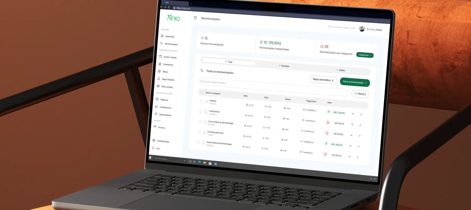
Transactions, the most-opened screen of the product
Before touching any flow, we mapped with the Arko team which screen opens most often in client meetings. It is Transactions: a table with everything pulled from the cards, counters at the top (total, categorized, uncategorized), and bulk actions. From it, we set the vocabulary and patterns the rest of the product would follow.
The project
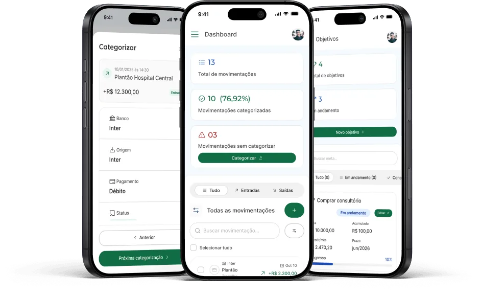
The scope covered eight product areas, rebuilt across desktop and mobile, with a unified visual system. The test we ran for every screen was whether the proposed pattern was generic fintech or came from the specific context of the doctor. When it was generic, we redid it. The product has two simultaneous use contexts. The doctor opens it directly to check balance, monthly spending, and closed shifts. The consultant runs the screen during a meeting, using the product as a base for the conversation with the client. The two situations demand different readings: density, information order, entry point. That weighed on several of the decisions that follow.
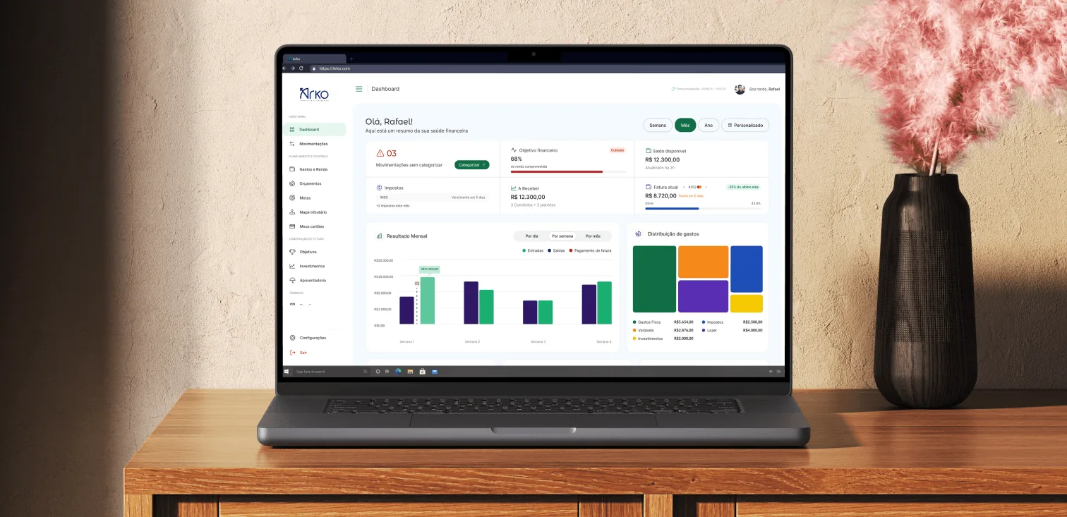
Dashboard as the entry screen, proposed by Otther
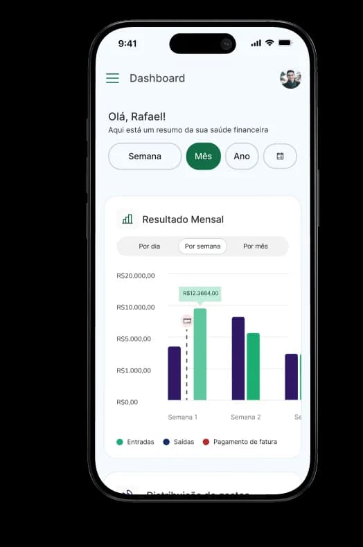
Our first proposal was an area that did not yet exist in the product. A Dashboard that opens the app already showing the month's financial state: balance, closed shifts, spending distribution by category, and a projection of what is left, all in a single read. Before this, the doctor had to open each module and stitch the pieces together mentally to get a sense of the month. The Dashboard concentrated that read in a single place and became the default entry point of the product.
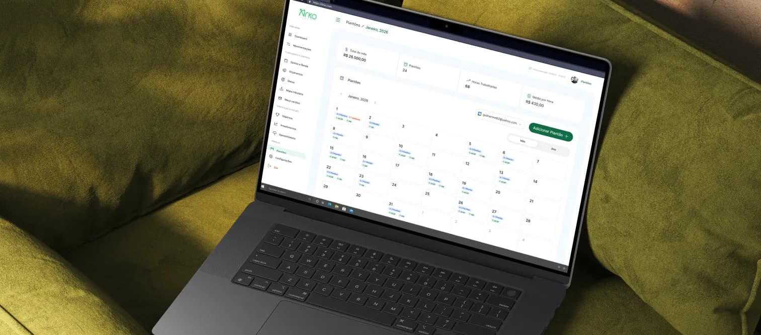
Shifts as a first-class module
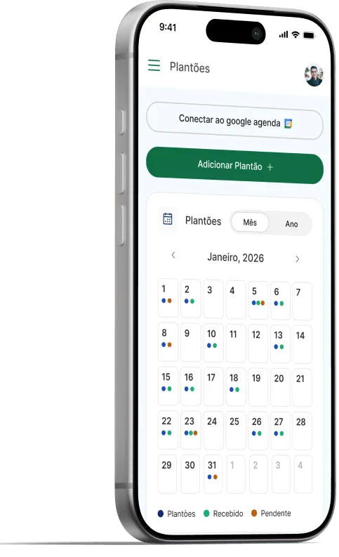
Shifts deserved their own treatment inside the product, not just a revenue line mixed in with other inflows. A doctor's shift operation involves scheduling, swapping turns with a colleague, billing later, and comparing what each hospital pays. Arko itself told us, in the first sessions, that shifts open almost every meeting with a client and are the financial topic that most slips out of control. We designed a dedicated Shifts area, with a grid of closed shifts, hospital-by-hospital comparison, and the month totals consolidated.
Transaction categorization
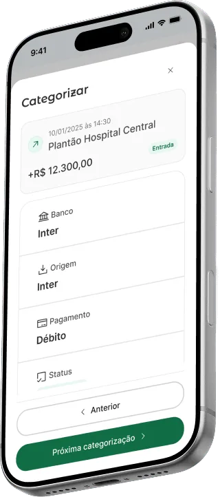
Card integration already pulled the statement into the product, but a statement without categories does not help much. A R$ 280 purchase at Drogaria São Paulo could be clinic supplies or personal vitamins, and no doctor is going to stop and classify transaction by transaction every month. We rebuilt the flow around automatic rules: the doctor categorizes a transaction once, saves it as a rule, and from then on every similar transaction lands in the right category on its own. The transactions area became something you can look at once and trust, instead of a list that asks for constant maintenance.
The visual system
We built a visual system to carry the product after we step away. Arko green comes with a brand logic: the color of incoming money and the color of health, the two halves of a doctor's life. From it, the eight areas use the same typography, the same modals, the same screen patterns. The doctor learns it once and the learning carries across the product. Arko evolves the product without deciding the color of a button on every new feature.